Brand design for an award winning film production company.
Exposure Labs
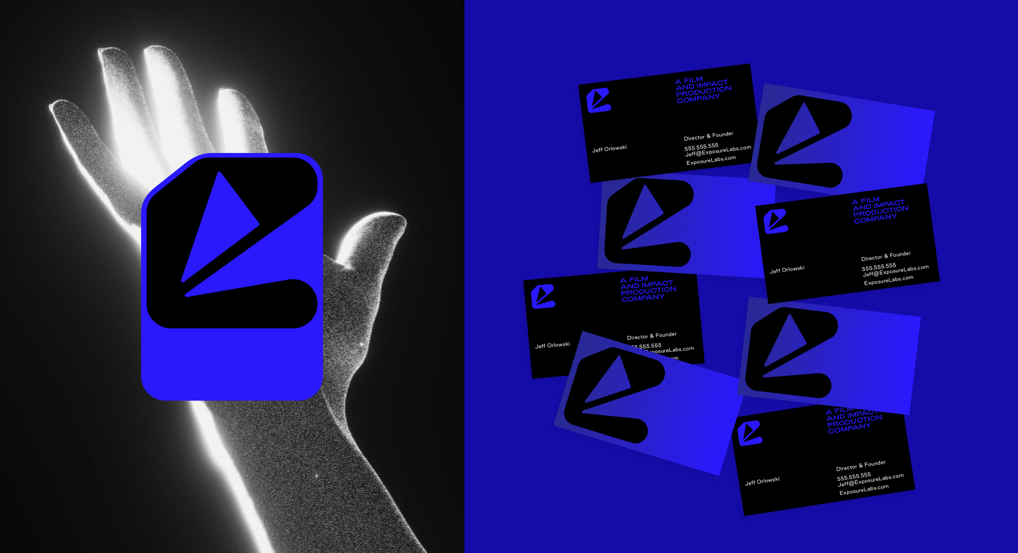
We initially explored 4 directions for Exposure labs. All rooted in the brand words but with different interpretations. Some leaned more experimental and others a more direct reflection of the brand name and world. This was a great exercise in pressure testing how far we could push the brand world and visual systems. Ultimately we landed on direction four which uses the spotlights to create a unique monogram.

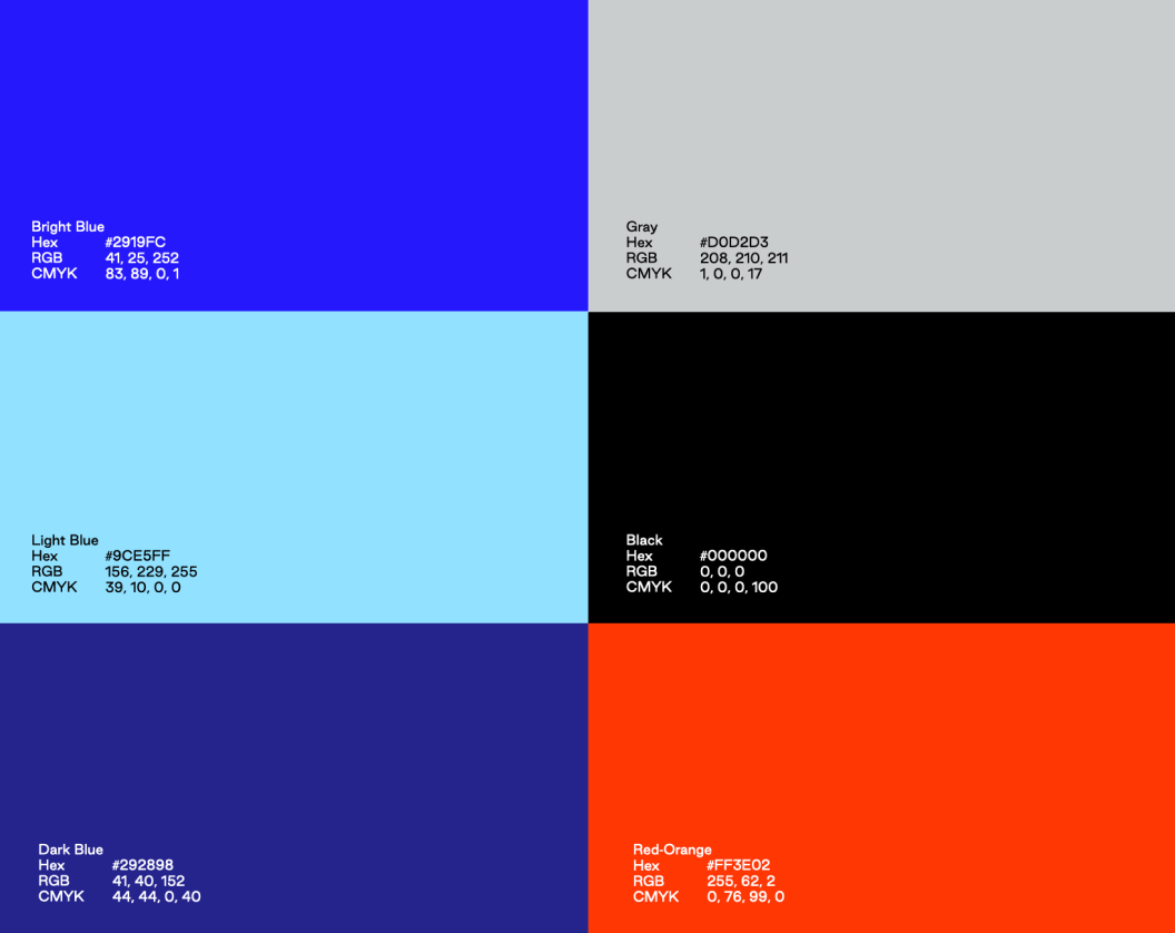
Premium Modern Industrial Ethical Kinetic
Premium Modern Industrial Ethical Kinetic
Logo Exploration

The geometric mark uses the shapes of the spotlights to reveal the e and L letterforms. The playful shapes and angles lean themselves to a more kinetic feel, further amplifying the energy in this direction. The mark is paired with a clean sans-serif font and bold black-and-white photography.